

REBECCA RUSCH

PROJECT SCOPE
Rebecca Rusch is more than just an endurance athlete. As a 7x world champion, best-selling author, activist, Emmy winner, self-proclaimed Queen of Pain, and damn good human - it's fair to say she's a legend.
Rebecca and her team wanted to elevate the Rebecca Rusch brand, beginning with fresh logos and a new website. We started by developing a suite of compatible logos for Rebecca's personal brand, Rusch Academy, the Be Good Foundation, and MTB Lao. We then took on her website by streamlining her personal site and creating a recognizable brand across all her endeavors - including Rebecca's Private Idaho.
At the core of this multi-staged project: visually representing what Rebecca stands for and lives for. As we continue to work with Rebecca and her team to create new assets, these original designs set the precedent for how Rebecca's enterprises look and feel.
DELIVERABLES
-
Strategy
-
Creative Direction
-
Branding
-
Logo Design
-
Sitemapping
-
UX Design & Build
-
Copywriting


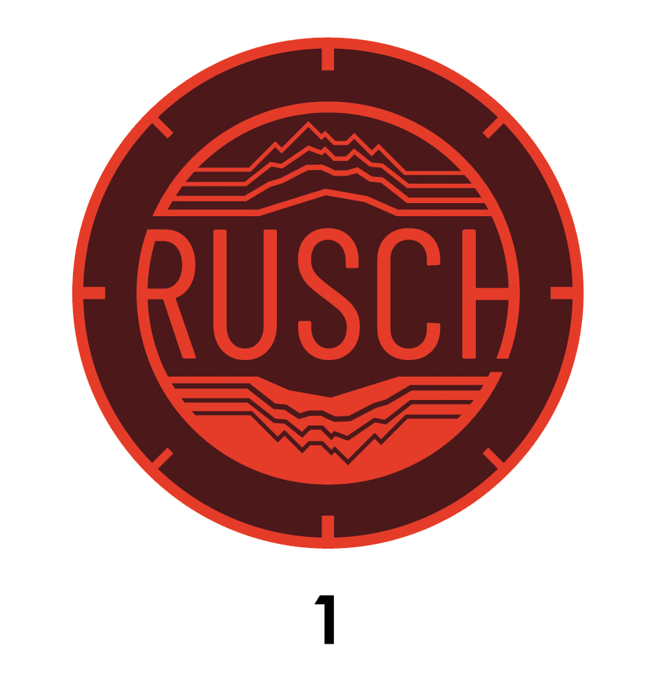
THE LOGO
So much of Rebecca's work is inspired by her father, who was shot down during the Vietnam war. The Rebecca Rusch logo incorporates the topographic lines of the exact location where her father passed away. An X marks the spot on the logo and the compass element reminds her of her true North and keeps her oriented on her path. Because this logo represents Rebecca's personal brand, we were able to feature these deeply personal elements that align with her ethos.
LOGO PROGRESSION
SECONDARYLOGOS


THE SITE
With all these different ventures under Rebecca's umbrella, she needed an easy-to-navigate website to be home to her work, writings, features, and events. Using the topo lines, mapping elements, and crisp colors featured in her logos, we built her a new site. First came prototyping in Adobe XD.


XD LAYOUT & PROTOTYPING

Color blocking and powerful imagery was the name of the game for this website design. We featured Rebecca's brand colors throughout each page and used a two-column layout to move the user's eye down the page. Because each logo we created for Rebecca featured similar colors and motifs, they seamlessly integrate into this website's design.
THE BUILD
GO BEHIND THE WHEEL


AFTER
BEFORE


BEFORE

AFTER

REBECCA'S PRIVATE IDAHO
BIB DESIGNS
We designed these branded bibs to illustrate the four race lengths and to give a preview of the bibs that will be used on race day.
LEARN MORE ABOUT REBECCA: