

RANCHLANDS

BEFORE WHEELIE
WHEELIE brought fresh, clean design to the site and restructured the site map to improve search engine results and site usability. What was left was a timeless yet modern site design as striking and exhilarating as the wild American West.

PROJECT SCOPE
Ranchlands is on the cutting edge of ranch management in the 21st century. While they are constantly innovating their approach to conservation, hospitality, and ecotourism, their web presence had grown outdated.
DELIVERABLES
-
Strategy
-
Creative Direction
-
Site Map
-
UX Design
-
Code Delivery

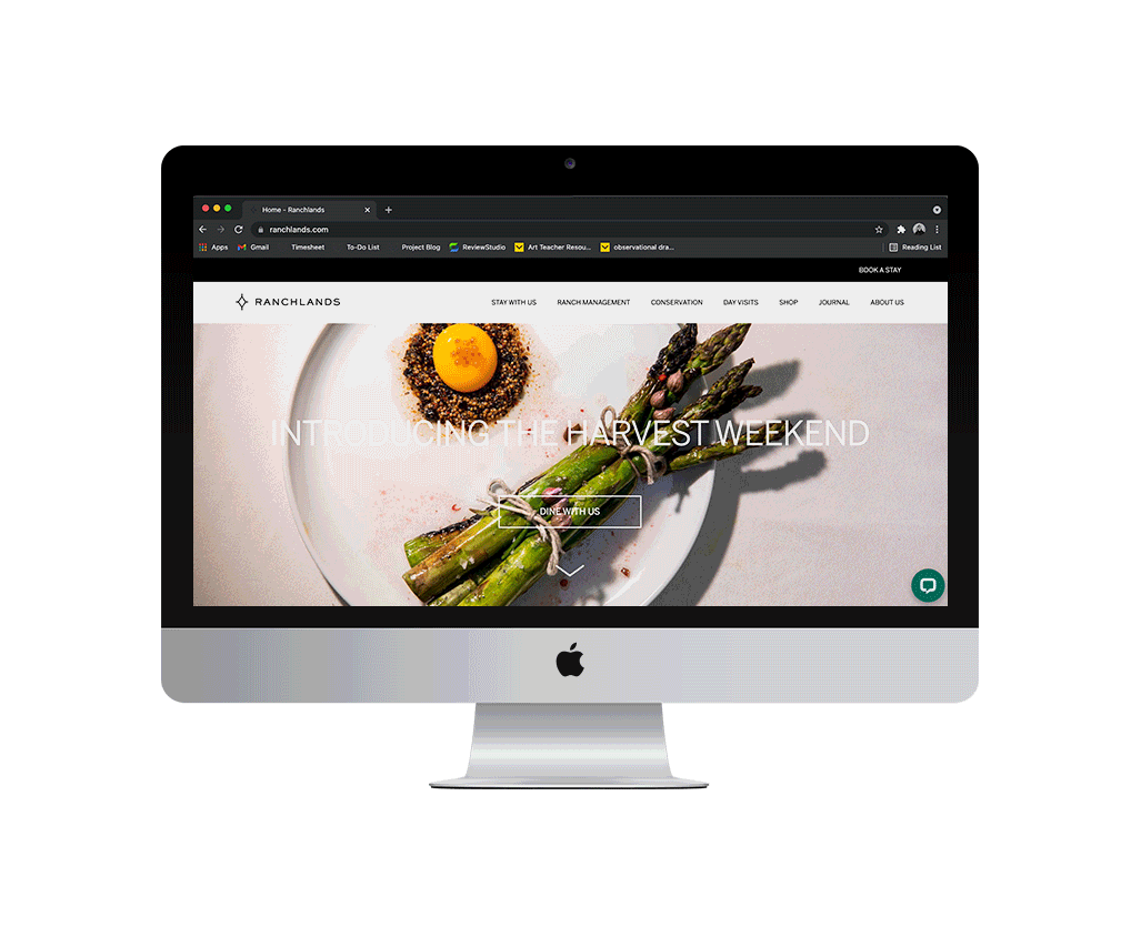
AFTER WHEELIE
After reorganizing the site map, condensing the navigation, and building page designs in Adobe XD, Ranchlands had a new look. The design gave the brand's collection of stellar photos room to shine without being overshadowed by heavy copy or ornate typefaces. The black, white, and grey color scheme allowed for the images to speak volumes about the work Ranchlands does.
The home page became an eye-catching and informative landing page, highlighting every aspect of the brand including the mercantile, hospitality option, and events on the Ranchlands properties. Clean text and strategic use of white space enhanced the user experience and white outlined buttons called attention to CTA's without covering up the imagery.
This new design ensures whether you're a landowner, a tourist, a shopper in search of a western gift, or someone looking to learn more about ranch management, there's a place for you to find what you're looking for.


